Monday, April 27, 2015
Assignment 7: portfolio - Poroject statement
For this project I don't have any big plans on how to incorporate my style into the book. The book should be cohesive and I feel like incorporating too much of my style would cause too much distraction from my work. I may do some work to the cover but I feel like that will be the most I do.
Saturday, April 25, 2015
Poster Final
Wednesday, April 15, 2015
Project 6 - Statement
For this assignment I will create a poster for the architecture of the Des Moines Art Center. I will most likely be focusing on a geometric part of the building, just because I prefer it for aesthetic reasons and also I feel like I can do some interesting work playing with the angles. I would like to incorporate some hand drawn elements because I'm very interested in mixing drawing with photography, but I don't want to add unrelated elements so this idea may be scrapped as I move along.
Sunday, April 12, 2015
Monday, February 23, 2015
Personal Symbols: Reflection
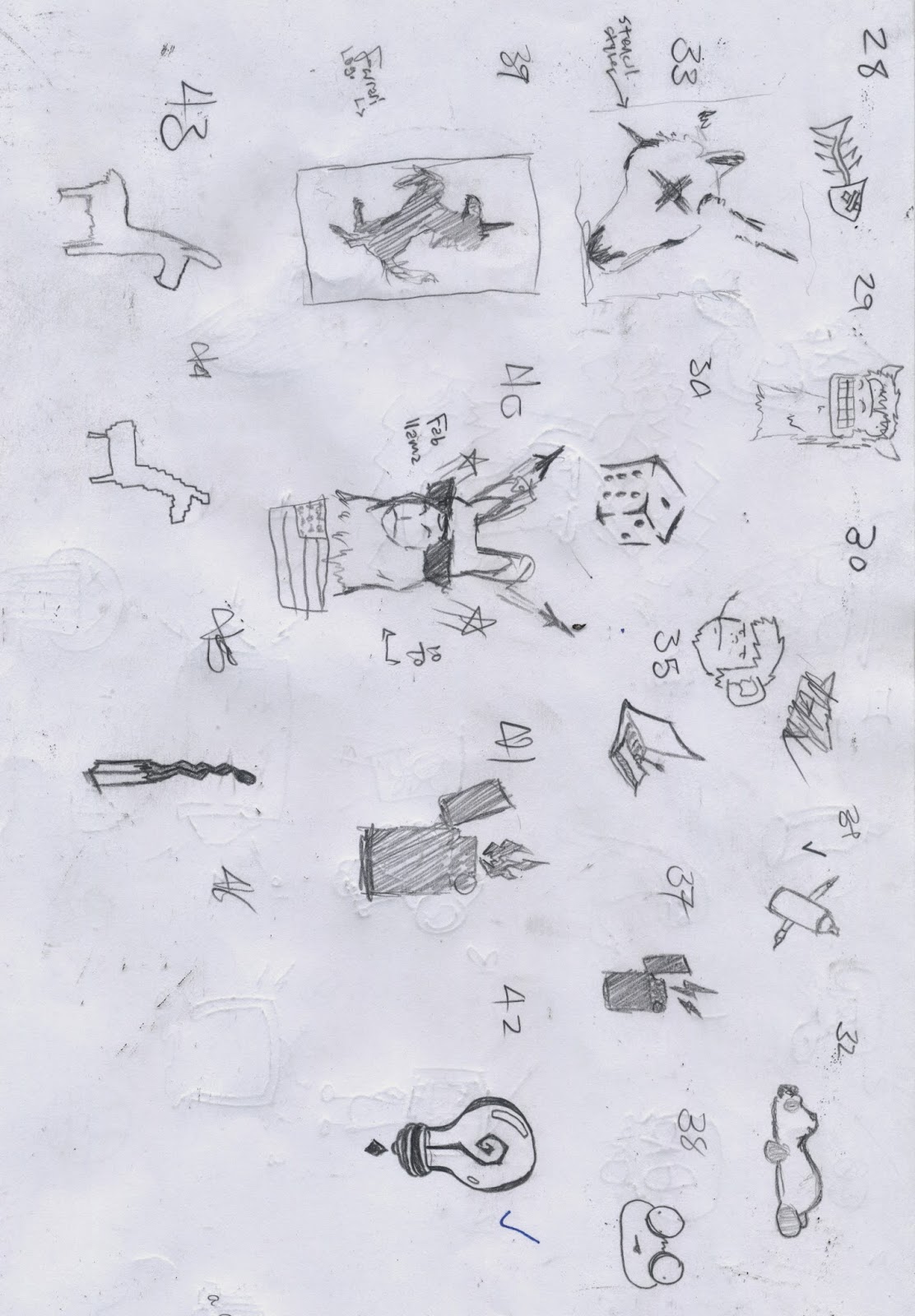
When starting the assignment I felt like my designs would follow along with a more cartoon like appearance. Most of my sketches follow along with this style, mainly the pictographs. Three dimensional lines and somewhat funny cartoon people and animals are things that commonly reoccur in my designs.
Once I finished working on my designs in illustrator I started to realize my pictographs felt rather different than the other symbols. Both my type and abstract symbols dealt with line in some sense but my pictographs fell into the cartoon like category.
I decided the little man puking the rainbow was my best option to move forward with. Although the rainbow would have been more fitting with my strange art style, the form I ended up with fit with the other designs better.
Monday, February 9, 2015
Personal Symbols: Project Statement
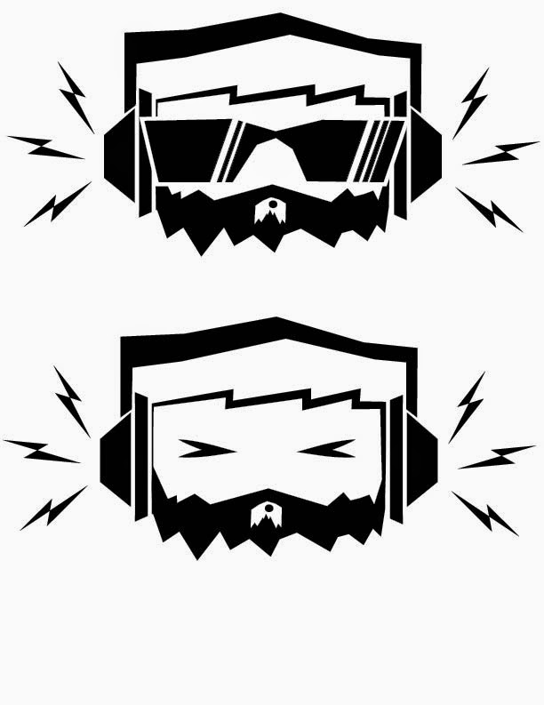
As a designer I am very graphic and illustrative. I often make designs that don't take themselves seriously, almost cartoon like. I'm not quite sure how the type based symbol will turn out but I see the pictograph and abstract symbols being cartoon-y.
Friday, February 6, 2015
Letter Study: Final Forms

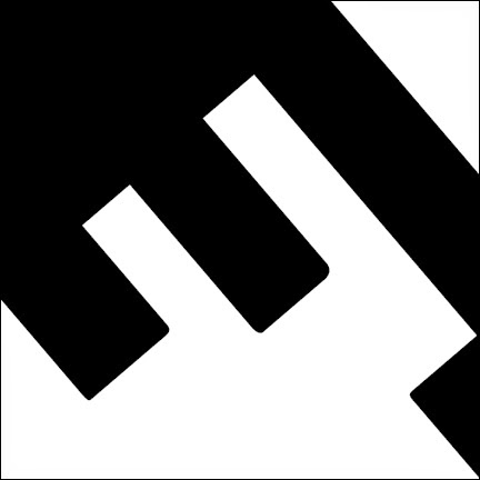
I finished up my two chosen designs by making slight adjustments to the ratio of black and white. I did this this to make the figure ground reversal stronger.
In the Z to the left I just removed a small amount of white from the corner.
In the F to the right I adjusted the width of the black to help it easily switch between a white E and black F.
Friday, January 30, 2015
Letter Form Study
Figure Ground Reversal

I started this project by looking for bold typefaces since it would be difficult to achieve figure ground reversal with a light font.
 Most of the project was trial and error. I would find a typeface I enjoyed and started typing letters until I saw an interesting curve or shape. Then I would scale the letter up, place it in my frame, and experiment with the placement.
Some of these succeeded while others didn't but in the end I came up with two satisfactory designs.
Subscribe to:
Comments (Atom)


